ニューモーフィズムが簡単に作れるツール紹介


ニューモーフィズムが簡単に作れるツールを見つけたので、実装してみました。
ニューモーフィズムとは何か、使い方、実装例を以下で紹介します。
ニューモーフィズムとは

ニューモーフィズム(Neumorphism)とは、ベース(背景)から要素が押し出されていたり、窪んでいたりするようなスタイルのデザイン手法です。
凹凸によって要素を表現しているため、ミニマルデザインとの相性がとても良く、美しく洗練された印象のデザインに仕上げることができます。
使い方
1,以下のサイトにアクセス
2,影や形を調整
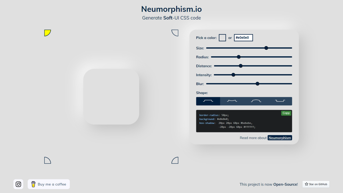
3,cssをコピーして実装する
実装例
以下の実装結果は上画像の様になります。
sample.html
<!DOCTYPE html>
<html lang="en">
<head>
<meta name="viewport" content="width=device-width, initial-scale=1.0">
<title>Document</title>
</head>
<body>
<div class = "contents">
<div class="button1">
<a class="icon" href="#">
</a>
</div>
<div class="button2">
<a class="icon" href="#">
</a>
</div>
<div class="button3">
<a class="icon" href="#">
</a>
</div>
<div class="button4">
<a class="icon" href="#">
</a>
</div>
</div>
</body>
</html>
sample.css
body{
background: #ebebeb;
}
.icon{
display: block;
font-size: 2em;
margin-top: 25px;
align-items: center;
color: rgb(88, 88, 88);
}
.contents{
text-align: center;
}
.button1{
width: 100px;
height: 100px;
margin: 10px;
display: inline-block;
background: #ebebeb;
box-shadow: 24px 24px 20px #d1d1d1,
-24px -24px 20px #ffffff;
}
.button2{
width: 100px;
height: 100px;
margin: 10px;
display: inline-block;
background: linear-gradient(145deg, #d4d4d4, #fbfbfb);
box-shadow: 24px 24px 20px #d1d1d1,
-24px -24px 20px #ffffff;
}
.button3{
width: 100px;
height: 100px;
margin: 10px;
display: inline-block;
background: linear-gradient(145deg, #fbfbfb, #d4d4d4);
box-shadow: 24px 24px 20px #d1d1d1,
-24px -24px 20px #ffffff;
}
.button4{
width: 100px;
height: 100px;
margin: 10px;
display: inline-block;
background: #ebebeb;
box-shadow: inset 24px 24px 20px #d1d1d1,
inset -24px -24px 20px #ffffff;
}